Devils Backbone Brewing Co., a major Virginia brewery bought by AB-InBev in 2016, has debuted new packaging.
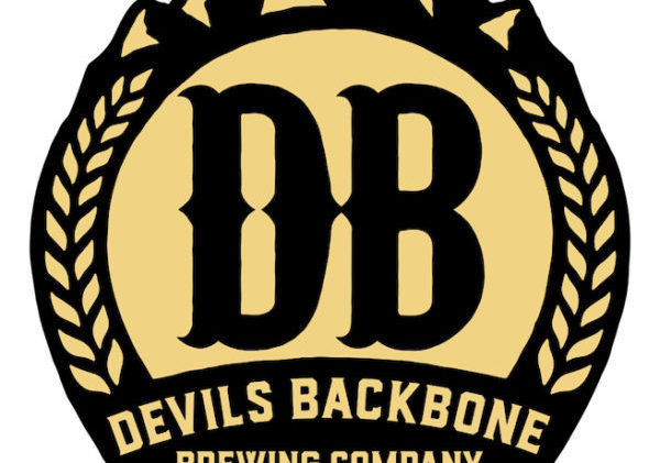
Timed with their 10th anniversary, Devils Backbone is modernizing its brand with a new logo and packaging design that “exemplifies its friendly, approachable, and outdoor personality and ‘Slow by Nature’ messaging,” the company says.
 Starting today the updated branding will roll out to market.
The aim was to streamline the old logo to complement the simplicity of the new packaging, and make it more noticeable amongst other brands. The look and feel of the packaging refresh is based on a “modern travel poster,” with illustrations featuring Virginia outdoor and landscape scenes.
New packaging invites the consumer to step inside snapshots of Virginia locations and stories, the company says: a view that wraps around all sides of the package to engage the consumer. Virginia’s Blue Ridge mountains are on the top of every package as the thread that weaves them all together
Developed by Devils Backbone’s long-time design agency Okay Yellow in partnership with Familiar Creatures, every aspect of the package design has a particular purpose and intention, including: Each bottle pack features a custom die cut reflecting the landscape of the Appalachian Mountains. Stylized beer names and styles are now more prominent on each package. Color coded crowns and sidebars with copy that reflects the brand’s personality and tells the story of Virginia. Custom bottom panels for each beer with fun facts.
Simplifying the new aesthetic is just the first step of Devils Backbone’s new marketing campaign launching in 2019: “Slow by Nature.” Slow by Nature exemplifies how Devils Backbone takes its time making lagers in the Virginia Heartland, the company says.


