Picture This. “Photos, that’s what’s it’s all about on drink menus,” enthuses Randy Steinbrenner, vice president of marketing for Dallas-based Romacorp, parent of the more than 220 Tony Roma’s restaurants.
Stuart Melia, director of beverage operations for Nashville, Tenn.-based, 230-unit O’Charley’s, agrees. “When we rolled out a new beverage menu this year,” he says, “our approach right from the beginning was that photography was going to be a huge part of it.”
What’s the magic of pictures? Mike Ginley, president of Next Level Marketing in Westport, Conn., cites a study that demonstrates consumers invariably choose pictured drinks over those that aren’t shown visually.
“If we have a drink that’s a bit unusual and unique—our Pineapple-Chipotle Margarita, for example—we picture it on the menu and that sells it. The photo gives it more oomph,” says Suzan Waldschmidt, director of beverage for 792-unit, Tampa, Fla.-based Outback Steakhouse.
Call to Order. Photographs help customers make that quick decision about what to drink. “Servers give customers a menu and right away ask for the drink order,” notes Ginley. “The customer doesn’t have a lot of time to read the list and make a choice.”
“If the menu just lists the spirits and mixers in a cocktail, especially for a signature drink, most customers won’t know what it will taste like,” offers Mark Vidano, vice president of operations for sales promotion consultancy MarkeTeam, based in Mission Viejo, Calif. Photos give guests immediate visual clues, he explains.
Thanks to enticing images on O’Charley’s new menu, “We’re seeing our signature cocktails replace the basic drinks people used to order when they didn’t have any idea of what we offered,” says Melia. “Now we’re showcasing our beverage talent with well-stylized shots—and getting good results.”
Which cocktails should get star billing? “We aggressively pictured our best drinks,” says Melia, “not only drinks that taste great but also those that deliver a higher margin and drive sales dollars.” Although he doesn’t have any hard data yet, Melia reports that he’s seen liquor, beer and wine sales increases since the menu rollout at the end of January—and those gains were driven largely by the pictured drinks.
Expert opinion varies regarding the number of drinks that should be in the spotlight, however.
“You can’t show all the drinks on your list,” says Patrick Henry, president of Stafford, Texas-based Patrick Henry Creative Promotions. He advises one or two images per page.
“We photographed every single drink for the menu we developed for Disney,” counters Vidano. Five drinks are shown per page, about 25 overall. “It’s a matter of how you lay it out,” he notes, adding that the Disney menu was a bit of an exception; he usually recommends showing only two or three drinks on a page.
Hero’s Welcome. The binder-style drink menu at Outback Steakhouse features just one very large photograph for each menu section, with the image going across the page spread and taking up more than half the layout. “We use a ‘hero’ shot for every section to sell the category,” explains Waldschmidt. “In previous menus, we had a bunch of photos lined up with their descriptions. Now we have a Martini that’s so [visually] inviting that guests are impelled to read the descriptions to see which drink is pictured, which means they might find others appealing, as well.”
On O’Charley’s new menu, the five top-selling drinks are those that are pictured, according to Melia, “and the top three sellers are hero shots.”
A full two-thirds of each spread in Tony Roma’s beverage book is devoted to photographs. Several drinks are shown, but most of the space goes to dramatic hero shots. Especially splashy is the Cadillac Top Shelf Romarita, which opens the menu. “The ‘splash’ is sexy, exciting,” says Steinbrenner.
But, he cautions, the drink you picture should be the same as the drink you serve. During photography sessions, all the drinks are made according to the recipes. “You don’t want a guest saying, ‘Hey, that’s not the drink I saw on the menu.’”
“Truth in advertising,” echoes Ginley. “You have to deliver what’s shown on your menu: Match the garnish, match the glassware, match the promise.”
Branding. Brands help sell drinks. “If you show on the menu that you make your Margarita with Patrón and Cointreau, with logos or bottle shots,” notes Steinbrenner, “customers will understand why you’re charging a premium for it.”
“On previous Outback menus, we played with beer logos,” recalls Waldschmidt, noting that guests might not be as familiar with Australian brands. With spirits, she believes, just mentioning brands in the descriptions is enough; there’s no need for logos.
“I’m not a big fan of logos,” admits MarkeTeam’s Vidano. “I’d rather do a bottle shot; it’s more subtle.”
Visual Clues. Of course, a great beverage menu is more than just pretty pictures. Visuals can reinforce and complement concept themes.
Framing Outback’s hero shots, for example, are dramatic silhouettes of exotic-looking landscapes. The effect is subtle but powerful in reinforcing the chain’s Australian theme. “Our brand design team used the colors and textures of the Australian Outback for a more authentic character,” notes Waldschmidt.
When developing the drink menu for Il Fornaio, the 20-unit, Corta Madera, Calif.-based chain, MarkeTeam used drawings of cocktails rather than photos. In keeping with the concept’s authentic Italian character, the style of the illustrations mimicked the great Italian artist Leonardo da Vinci. “It was an effective design element,” says Vidano.
Fonts of Wisdom. Typeface is an important part of a menu’s visual look. It’s best to pick just one or two typefaces and stick with them. Too many can muddle the message.
Tony Roma’s mostly uses a single typeface. “It’s the same type in the drink menu as it is on the food menu,” notes Steinbrenner. That typeface is carried throughout all brand collateral, including POS materials and even on TV ad spots, becoming an integral part of the brand.
As for styles, clean, simple typography works best. “Script fonts don’t read well,” says MarkeTeam’s Vidano.
At Outback, Waldschmidt feels that white type on a dark background “really pops.” Font size counts, also, she adds, especially in the atmospheric lighting used in many restaurants.
“My staff gets tired of me saying, ‘Use larger type,’” says Henry. “But, I’ll turn the light out and ask my graphic designers, ‘Can you read this now?’ You’ve got to have larger type for people to read when the lighting’s dim, as it is in most restaurants.” Henry also advises using bolder fonts and black or dark-colored type.
Juggling Act. Perhaps the most difficult part of beverage menu design is fitting all the graphic elements together into an attractive and cohesive whole.
“We had talked a little about using bigger type,” recalls Waldschmidt, speaking of the development of the Outback menu, “but we think evocative descriptions really help to sell the drinks.” So, larger type was nixed in favor of more words. “Given the layout, there’s only so much you can fit in,” she explains.
“It’s always a struggle between the graphic designers and the marketing folks,” laments Steinbrenner. “Designers don’t want to clutter up the page too much, and marketers want to take advantage of as much of the space as they can to sell those drinks.” The key is striking the right balance.
Whether going with more words or more white space, a drink menu’s visual presentation can make the difference between a sale and a lost opportunity. l
Thomas Henry Strenk is a New York-based freelance writer who specializes in food and beverage topics.
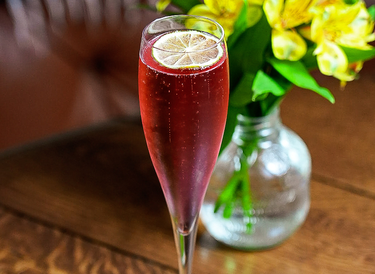
Photos sell drinks; it is no coincidence that each of the five best-selling drinks at 230-unit O’Charley’s is pictured on the menu.
Outback Steakhouse reinforces its brand with strategic silhouettes on its menu (above), while the Corta Madera, Calif.-based Il Fornaio chain plays up its Italian character with drawings that evoke Leonardo da Vinci (lower right).